Recent Activity
-


-

-

Tony's Thoughts
Omar Yaghi, Nobel-Winning U.S. Chemist Moves to China to Lead A.I. Institute
 Omar Yaghi. Credit…Sophie Park for The New York Times Dear Commons Community, Omar Yaghi, an immigrant to the United States who […]
 -
Tony's Thoughts
Map: States Where Critical Race Theory Is under Attack
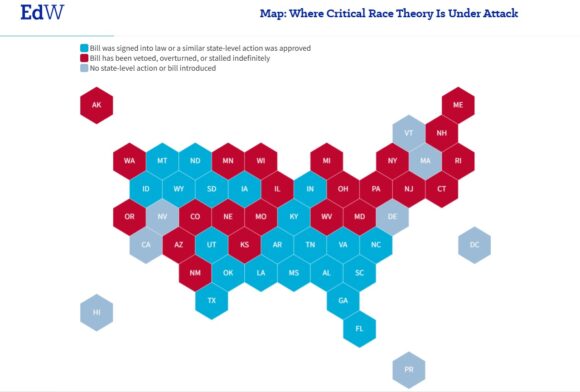 Click on to enlarge. Dear Commons Community, Education Week has provided an analysis with a map (above) showing where critical race […]
 -

-

-
-

-

-

-

-

-
-

-

-

-

-
-
Tony's Thoughts
Fox News Ratings Down in Latest Polling!
Dear Commons Community, Adweek is reporting that the cable news ratings for June 2026 are in, and while Fox News remained comfortably in […]
-
Tony's Thoughts
Graham Platner Suspends Maine Senate Bid after Rape Accusation
 Graham Platner. Credit…Sophie Park for The New York Times. Dear Commons Community, Graham Platner, the Democratic nominee for Senate […]
 - Load More