On TAPoR: http://tapor.ca/tools/857
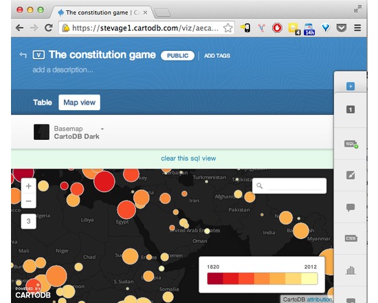
CartoDB makes data-driven map visualisation tool. It’s very easy to upload a couple of spreadsheets of data, with latitudes and longitudes or addresses, and turn them into clickable markers on maps. There are several types of pre-canned visualisation, such as categories, choropleths or even animated “torque” maps. It’s also a sophisticated platform allowing complex visualisations to be built up using Javascript and the CartoDB API.
Users on CUNY Academic Commons
Explore more tools from TAPoR on the Digital Tools Directory.

